4-1 Screen layout and operations of Form Designer
Form Designer allows you to design forms. The Form Designer screen is shown below. This section gives an overview of the screen divided into seven main areas.
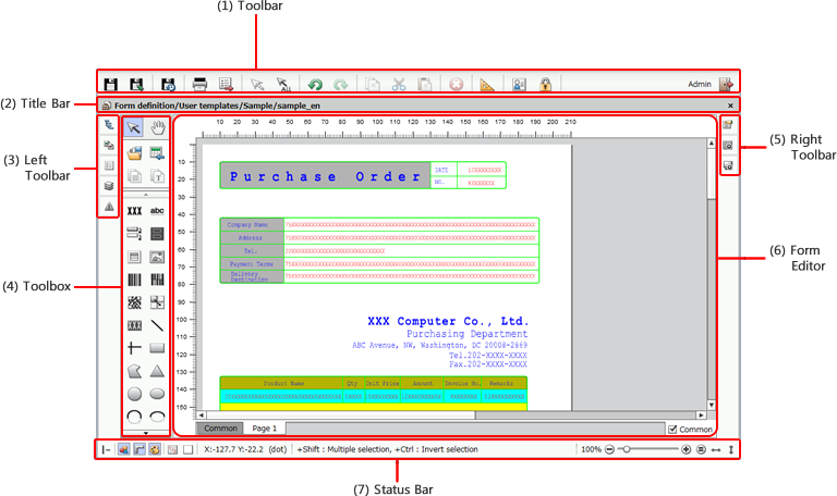
(1) Toolbar
The toolbar allows you to save a form definition, perform test print, select or copy an item, set default values for items, configure user profile settings, and perform other operations.

Item | Description |
|---|---|
(a) | Saves the form definition currently being edited. You can perform the same operation by pressing CTRL+SHIFT+S. For details, see "Overwrite an existing file" in "3-7 Save a form definition". |
(b) | Saves the form definition currently being edited as a new form definition. For details, see "Save as a new form definition" in "3-7 Save a form definition". |
(c) | Saves the form definition currently being edited as a backup file on the client machine. For details, see "Save as a client backup file" in "3-7 Save a form definition". |
(d) | Prints test data. For details, see "4-12-1 Test print operations". |
(e) | Saves item settings to a CSV file. For details, see "Save properties settings to a CSV file" in "4-10-2 Set properties of multiple items in bulk". |
(f) | Deselects selected items. |
(g) | Selects all items on Form Editor. You can perform the same operation by pressing CTRL+A. |
(h) | Cancels previous operations. You can perform the same operation by pressing CTRL+Z. |
(i) | Redoes canceled operations. You can perform the same operation by pressing CTRL+Y. |
(j) | Copies the selected item to the clipboard. You can perform the same operation by pressing CTRL+C. |
(k) | Cuts and copies the selected item to the clipboard. You can perform the same operation by pressing CTRL+X. |
(l) | Pastes the item copied to the clipboard. You can perform the same operation by pressing CTRL+V. |
(m) | Deletes the selected item. You can perform the same operation by pressing DELETE. ReferenceWhen a subform, record or formcopy is deleted, if any items are contained within its hierarchy, those items will also be deleted. |
(n) | Sets the default values of items. For details, see "4-3-2 Set initial values of items". |
(o) | Sets the display language and work environment for the login user. For details, see "2-2 Set user profile". |
(p) | This button does not appear in SVF Cloud Designer. |
(q) | Exits SVF Cloud Designer. |


(2) Title bar
The title bar shows the title of the form definition currently being edited. The Close form definition button is also placed here.

Item | Description |
|---|---|
(a) Title | Shows the path of the form definition currently being designed with Form Designer. Format: <directory_name>/<form_definition_name> |
(b) Close form definition | Closes the form definition currently being designed. If the form definition has not been saved, a confirmation message appears. When you close the form definition, the Explorer screen appears. |
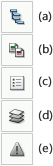
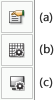
(3) Left toolbar
The left toolbar contains the following buttons. Clicking these buttons opens the corresponding windows.
Item | Description | ||||||
|---|---|---|---|---|---|---|---|
(a) | Open the References window. For details, see ""References" window" in "4-13 Set various files". | ||||||
(b) | Open the Compare form window. A form specified from the revision history can be superimposed on the form currently being designed, so that these forms can be compared. For details, see "4-14-1 Display the form specified in revision history on the Form Editor". | ||||||
(c) | Open the Items window. The names of items placed on Form Editor and the parent-child relationships between them are displayed. For details, see ""Items" window" in "4-5 Basic operations of items". | ||||||
(d) | Open the Layer window. For details, see ""Layer" window" in "4-5-8 Arrange items to be overlapped - operations on the "Layer" window". | ||||||
(e) | Open the Error and Warning list window. For details, see "4-3-5 Check the list of errors and warnings in form definition". ReferenceIf the form contains an error or warning, the color of the Error and Warning list button changes.
|


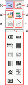
(4) Toolbox
The toolbox contains various items and features for operating these items.
Item | Description |
|---|---|
(a) | Mouse cursor becomes For details, see "4-5-1 Select items". |
(b) | The pointer changes to The Form Editor screen can be scrolled by using Hand scroll or the scroll bar. |
(c) | Select multi-item dialog is displayed, and a registered multi-item is called. For details, see "Place multi-item" in "4-10-1 Register items for repetitive use (Multi-item)". |
(d) | Loads an image file to be used for a template as a form image (sample). For details, see "4-3-4 Load a form image and create lines and texts automatically". |
(e) | Recognize the lines in a form image (sample) loaded by Load background form image and automatically create ruled lines. For details, see "Automatically create ruled lines from form image" in "4-3-4 Load a form image and create lines and texts automatically". |
(f) | Recognize the character in a form image (sample) loaded by Load background form image and automatically creates static text. For details, see "Automatically create static text from form images" in "4-3-4 Load a form image and create lines and texts automatically". |
(g) Items, charts, and text frame  | Creates an item, chart or text frame. For details on items, see "4-6 Create items" and "4-7 Create items (Shape)". For details on the chart, see "4-8 Create items (Chart)". For details on the textframe, see "4-9 Creation of items (TextFrame)". |


(5) Right toolbar
The right toolbar contains the following buttons. Clicking these buttons opens the corresponding windows.
Item | Description |
|---|---|
(a) | Opens the Properties Editor. Use this to set the properties of the item selected on Form Editor. The mode of the selected item is displayed at the top of the Properties Editor. Item properties displayed differ from item to item. For details on the paper properties, see "4-3-3 Set paper format". For details on items properties, see "4-6 Create items", "4-7 Create items (Shape)", "4-8 Create items (Chart)", and "4-9 Creation of items (TextFrame)". |
(b) | The Grid settings window is displayed. For details, see "Configure grid settings" in "4-3-1 Use the auxiliary features for layout". |
(c) | The Display settings window is displayed. For details, see "Display settings" in "4-3-1 Use the auxiliary features for layout". |


(6) Form Editor
The Form Editor is where you design and place items on a form.

Item | Description |
|---|---|
(a) Page tab | According to the value of Multi-page count set in the paper properties, the tab to display the page is displayed. On the Common page, place items common to all pages. On pages other than Common, in addition to the items created on the Common page, place items specific to each page. For details, see "4-5-7 Set editable items for each page". |
(b) Common | The operation is possible when a page other than Common is selected in the "page tab". Shows/hides items placed on the Common page. |
(7) Status bar
The status bar contains layout subfeatures and the controls for changing the zoom factor of Form Editor.

Item | Description |
|---|---|
(a) | With Fit mode selected, when drawing a ruled line inside a rectangle or placing a record in a subform, the ruled line will automatically fit inside the frame, and the record width will automatically adjust to fit the subform. For details, see "Fit mode" in "4-3-1 Use the auxiliary features for layout". |
(b) | Shows/hides the toolbox. Click the button to show or hide the toolbox. |
(c) | Shows/hides the rulers at the upper and left edges of Form Editor. For details, see "Display settings" in "4-3-1 Use the auxiliary features for layout". |
(d) | Sets the colors of items displayed on Form Editor. For details, see "4-11-1 Design colors and print colors". |
(e) | Sets the grid accuracy for arranging items. For details, see "Grid" in "4-3-1 Use the auxiliary features for layout". |
(f) | Sets the way in which the grid is displayed. For details, see "Grid" in "4-3-1 Use the auxiliary features for layout". |
(g) Status bar | Shows the position of the pointer on Form Editor and descriptions of mouse and key operations. |
(h) Slider and buttons to change the zoom factor | Changes the zoom factor of Form Editor. For details, see "Change the zoom" in "4-3-1 Use the auxiliary features for layout". |


