4-8 Create items (Chart)
SVF Cloud Designer provides features to output data as charts. Chart is an item that can only be configured in graphic mode.
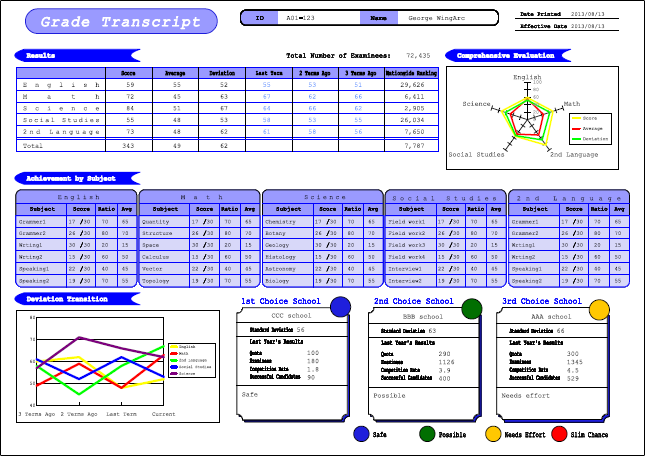
Example of a form with charts
Types of charts that can be created
The charts SVF Cloud Designer can create are broadly classified into rectangular and circular charts. These two types are both subdivided into three sub-types, so a total of six sub-types are available as follows:
Rectangle charts (bar chart, line chart, and area chart)
Bar charts, line charts, and area charts are classified as rectangle charts because the data is drawn in a rectangle area.
Item
Description

Bar chart
This is the most commonly used chart type. Use this chart type when you want to compare values across categories.
The chart data is grouped by category name, and the bar chart appears for each data category. You can color each bar chart by data series.
You can also create a horizontal bar chart or cumulative chart. Horizontal bar charts are useful when the category names are long.

Line chart
Use this chart type when you want to show changes or trends over a time period.
The points on the lines in line charts represent data values. The data values in each series are connected by a line to represent data trends for each category. The category names are used as the category axis label and the data of each series appears with individual lines.

Area chart
This chart type combines the functionality of line charts and stacked bar charts. Use this chart if you want to show the changes in multiple data and highlight the differences between different data.
Areas below the lines appear in different colors. You can mainly use this chart as a stacked chart. The area size for each category represents the total data value of the category.
Circular charts (radar chart, pie chart, and doughnut chart)
Radar charts, pie charts, and doughnut charts are classified as circular charts because the data is drawn in a circular area.
Item
Description

Radar chart
Use this chart when you want to compare values relative to a center point. The chart has a unique radar shape and uses a radial grid to represent the data. The chart shows that values increase as their distance from the center point becomes larger.

Pie chart
Use this chart when you want to show the proportion of the data relative to the total value. Pie charts show all category data in a circle. Each data appears as a section of the circle, and the size is in proportion to their value.

Doughnut chart
Use this chart when you want to display the relation of a value to the total data or a comparison of values.
Basic flow of creating a chart
The basic flow of creating a chart is as follows:
Step 1 Create a new chart
Specify the create area of a chart in the Form Editor, and specify the type of chart in the Create new chart dialog.
At this point, the chart is created from sample data values provided by SVF Cloud Designer.
For details, see "4-8-2 Create a new chart".
Step 2 Making chart execution settings
Specify the data you want to display in the chart. There are two methods to specify data:
Use fixed data files
Import a specific CSV file and create a chart by using the values in the file.
You can specify another CSV file during execution by using the SET_CSV function of an attribute-formula.
How to reference an item in an XML format file
Create a chart by referring to the fields and the static text in an XML form file. You can also create a chart in a record.
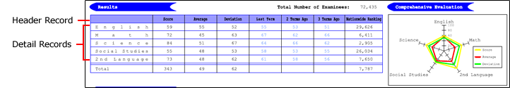
For example, in the following form, the fields of the detail records that contain scores, average values, and deviation values are referenced as the data series of the radar chart, while the static texts in the header record are referenced as the data series names:
For details, see "4-8-4 Set how to output data".
Step 3 Change the type and sub-type of a chart
You can change the type and sub-type of the chart specified in Step 1 if necessary. If you change the chart type, the settings you have made for the chart return to the default values. Therefore, make a decision on the type and sub-type of the chart as early as possible.
For details, see "Layout of the "Chart settings" dialog" - "(4) Change chart" in "4-8-3 Set chart properties".
Step 4 Change detailed chart settings
You can make the chart more readable by changing detailed settings, for example, by adjusting the fonts and sizes of labels, standardizing colors and patterns for series and the legend, and adding auxiliary lines.
For details, see "4-8-5 Change chart area settings" and subsequent sections.