4-8-11 Change data series settings
You can change the following settings for each series in Series<n> ("n" is any given number) on the Chart settings dialog:
Value axis corresponding to data series (rectangular charts)
Data series fill
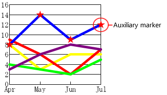
Auxiliary markers for data series (line charts and radar charts)
Data series labels
Colors for categories in a chart with one data series
Attribute-formula
For details on the display example of the series in each chart, see "4-8-1 Chart components".
Data series settings for rectangular charts
This section describes series settings for rectangular charts (bar chart, line chart, and area chart) using Series1 as an example.
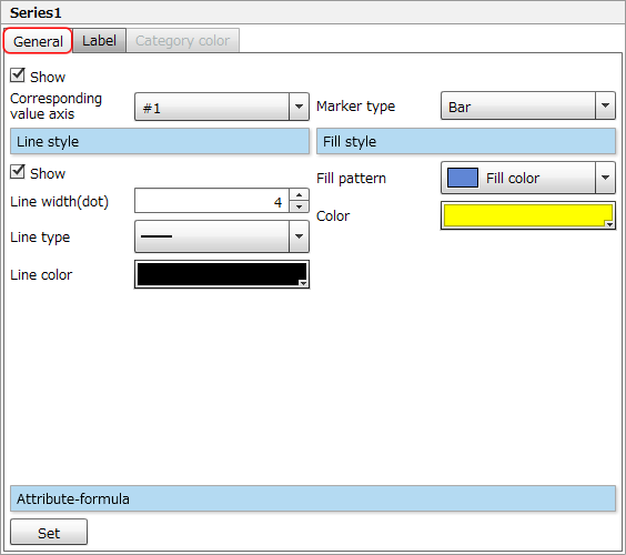
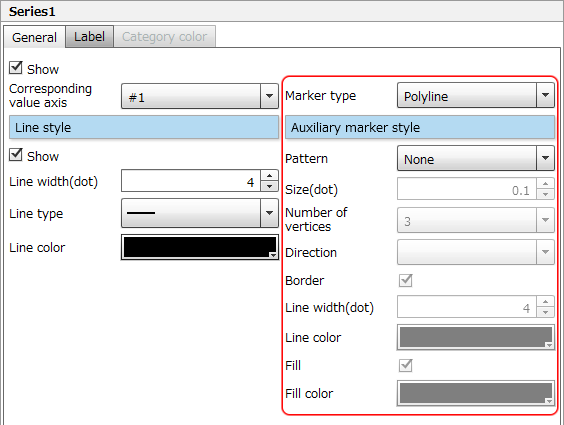
Set the corresponding value axis, marker type and style for a data series on the "General" tab for rectangular charts
The setting items on the General tab are as follows:
Item | Description |
|---|---|
Show | Select the check box to display the data series. |
Corresponding value axis | Select the corresponding value axis for the series from "#1" or "#2". ReferenceYou can also select the corresponding value axis in Corresponding value axis in Axis settings. Both settings are synchronized. For details on Corresponding value axis in Axis settings, see "Corresponding value axis" in "4-8-8 Change rectangular chart axis settings". |
Marker type | Select a marker type. The settings vary depending on the marker types as shown in the following table:
|
Attribute-formula | Specify an attribute-formula. The setting procedure is the same as that for chart area attribute-formulas. For details, see "Attribute-formula" in "4-8-5 Change chart area settings". |
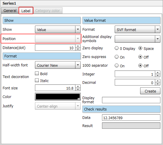
Data series labels on the "Label" tab for rectangular charts
The setting items on the Label tab are as follows:
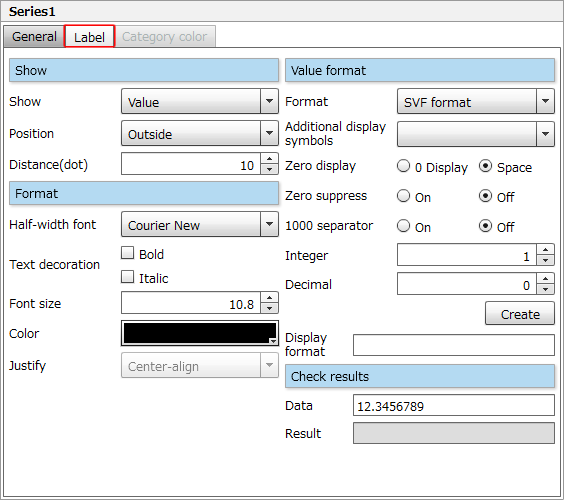
Item | Description |
|---|---|
Show |
|
Format | Specify label font, text decoration, font size, text color and text alignment. The setting procedure is the same as that for legend text. For details, see "Legend string- "Format" tab" in "4-8-6 Change legend settings". |
Value format | When "Value" or "Percentage" is selected in Show, set Value format. The setting procedure is the same as that for value axis labels in rectangular charts. For details, see "Value format" in "4-8-8 Change rectangular chart axis settings". |
Check results | When inputting a value in Data, a formula which has been automatically created based on the Value format settings is applied to the value of Data and displayed in Result. |
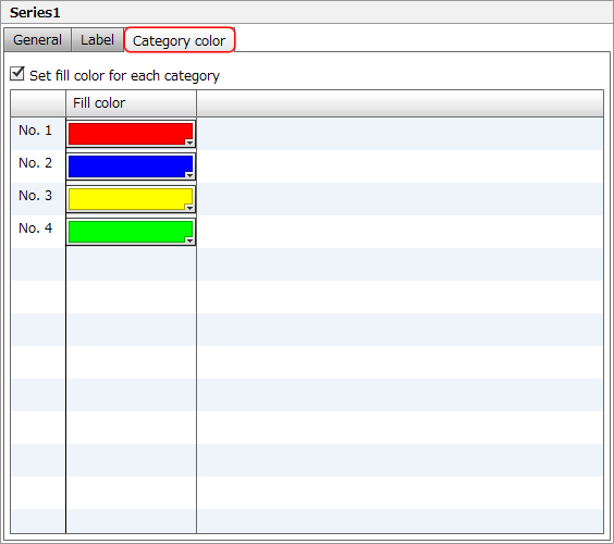
Individual categories in a single data series on the "Category color" tab for rectangular charts
The Category color tab is available in a series of rectangular charts, and you can set a fill color for each category.
Item | Description |
|---|---|
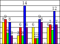
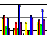
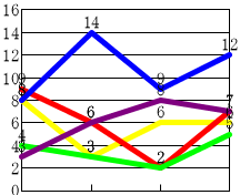
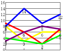
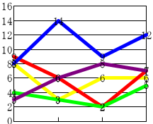
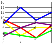
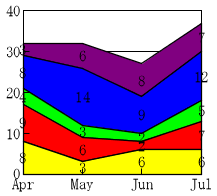
Set fill color for each category | Select the check box to set a fill color for each category, and then select the colors from the color palette. 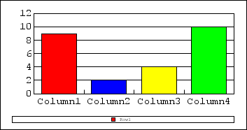 A series of bar graphs with a fill color set for each item ReferenceIn a series of line chart, the color specified on the Category color tab is reflected as the fill color of auxiliary markers. However, it is reflected only when one of " 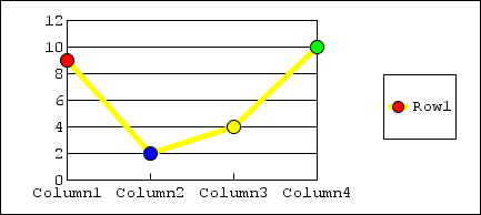 Fill color for the auxiliary markers in a line chart with one data series |
Data series settings for circular charts
This section describes series settings for circular charts (radar chart, pie chart, and doughnut chart) using Series1 as an example. For circular charts, the setting items on the General tab are different for radar charts, pie charts, and doughnut charts.
Set data series display, auxiliary markers, and style on the "General" tab for radar charts
The setting items on the General tab in the radar chart are as follows:
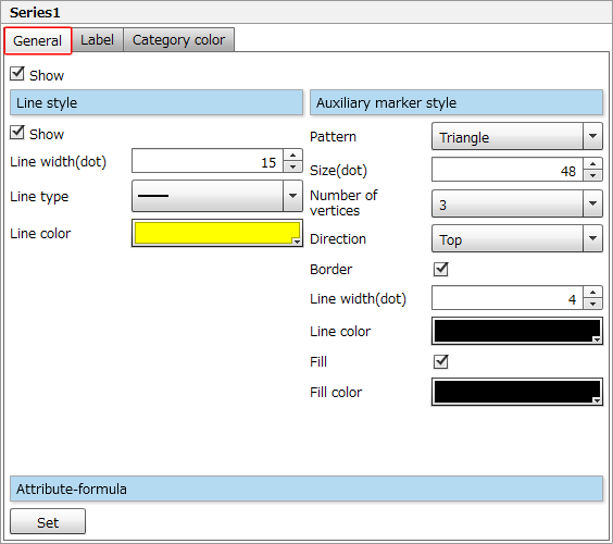
Item | Description |
|---|---|
Show | Select the check box to display the data series. |
Line style | Select the Show check box to display lines, and specify the line style. The setting procedure is the same as that for chart area borders. For details, see "Border style" in "4-8-5 Change chart area settings". |
Auxiliary marker style | Set the shape and size of auxiliary markers. The setting procedure is the same as the "Auxiliary marker style" of line charts. 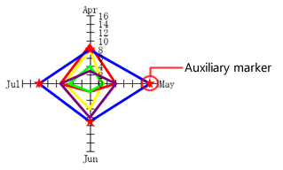 Auxiliary markers in a radar chart ReferenceIf you select Internal fill in Radar Attributes under Data marker, Fill style will be displayed instead of Auxiliary marker style, and you can set the fill color for a radar chart. For details, see "Radar Attributes" in "4-8-10 Change data marker settings". |
Attribute-formula | Specify an attribute-formula. The setting procedure is the same as that for chart area attribute-formulas. For details, see "Attribute-formula" in "4-8-5 Change chart area settings". |
Set data series display, fill pattern and style on the "General" tab for pie charts and doughnut charts
The setting items on the General tab in the pie chart and doughnut chart are as follows:
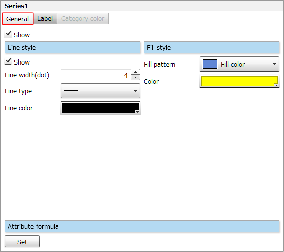
Item | Description |
|---|---|
Show | Select the check box to display the data series. |
Line style | Select the Show check box to show borders for the data series, and specify the line style. The setting procedure is the same as that for chart area borders. For details, see "Border style" in "4-8-5 Change chart area settings". |
Fill style | Specify the fill color for the data series. The setting procedure is the same as that for chart area background. For details, see "Background style" in "4-8-5 Change chart area settings". Note that you can select only "Gradation2" for a gradation. In addition, you cannot specify the diagonal direction of "Gradation2". |
Attribute-formula | Specify an attribute-formula. The setting procedure is the same as that for chart area attribute-formulas. For details, see "Attribute-formula" in "4-8-5 Change chart area settings". |
Data series labels on the "Label" tab for circular charts
The setting items on the Label tab are as follows:
Specify data series labels. The setting procedure is the same as that for rectangular charts. Note that you cannot specify Position of the labels.
For details, see "Series labels - "Label" tab of rectangular charts".
Reference
When the Use leader line check box in Data marker is selected, if you specify Distance(dot) to show the label outside the circle, the label is always displayed with a leader line.
For details on the leader line, see "Leader line" in "4-8-10 Change data marker settings".
Set individual categories in a single data series on the "Category color" tab for circular charts
As with rectangular charts, the Category color tab is available for a series of circular charts, and you can set a fill color for each category.
For details of the setting procedure, see "Individual setting of a series of categories - the "Category color" tab of rectangular charts".
Reference
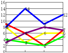
In a radar chart with one data series, the color specified on the Category color tab is reflected as the fill color of auxiliary markers.
However, it is reflected only when one of " ", "
", " ", or "
 " is selected in Pattern in Auxiliary marker style on the General tab.
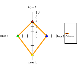
Fill color for auxiliary markers in a radar chart with one data series