Chart area properties (rectangular chart)
This section describes the property settings of rectangle charts (bar charts, line charts, and area charts).
Set the background color and border of the chart area ("General" tab)
In the General tab, set the background color, border, and attribute-formula of the chart area.
Item | Description | ||||||||||||
|---|---|---|---|---|---|---|---|---|---|---|---|---|---|
Border style | To display the border, select the Show check box, and then specify the line width, line type, and line color. | ||||||||||||
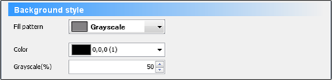
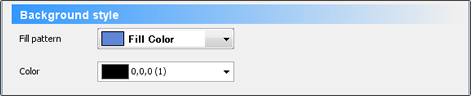
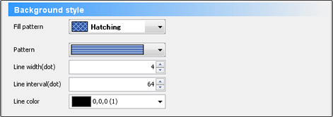
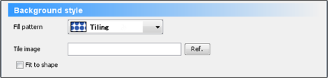
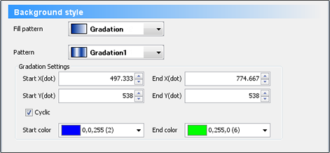
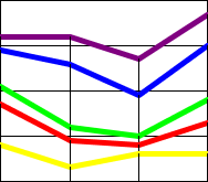
Background style | Specify the paint pattern of the background color of the chart area.
| ||||||||||||
Attribute-formula | Specify an attribute-formula. |


Set an axis ("Direction and Display" tab)
In the Direction and Display tab, set the direction of the item axis and value axis, show/hide of each axis, show/hide of the legend, etc.
Item | Description |
|---|---|
Chart direction | You can change the direction of the category axis and value axis to display. Value axis is vertical (left) and value axis is horizontal (right) 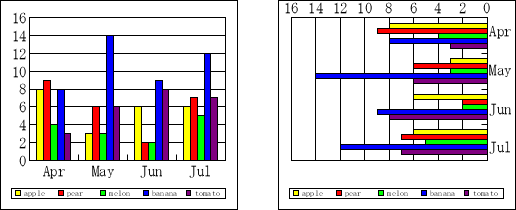 ReferenceFor "Item axis is horizontal and value axis is vertical", the bottom left is the starting point. The item axis increases from left to right and the value axis increases from bottom to top. For "Item axis is vertical and value axis is horizontal", the upper right is the starting point. The item axis increases from top to bottom, and the value axis increases from right to left. |
Show | Specify whether to show or hide the category axis, value axis, legend, and secondary category axis. RestrictionEven when you select the check box for the secondary category axis, the secondary category axis does not appear if the data series is not specified for the secondary value axis in the Series tab. The secondary category axis may appear completely overlapping the first category axis. |
Set data series ("Series" Tab)
In the Series tab, you can specify the data series to be set to the first value axis and the secondary value axis. Configure the show/hide settings individually for each data series.
Item | Description |
|---|---|
Corresponding value axis | Specify the data series to be set to the first value axis and the secondary value axis. The data series set to the secondary value axis appears on top of the data series for the first value axis. You can also set the value axis in properties of each data series. Both settings are synchronized. |
Show series | Configure the show/hide settings individually for each data series. Data series in Show appears in the chart. If the data series is moved to Hide, it will not appear in the chart. |
Set the data marker ("Marker group 1" Tab)
On the Marker group 1 tab, set the display format of the series, the overlap of the series data, the display interval between the item data, the show/hide of the auxiliary line, etc.
In the Corresponding value axis field of the Series tab, if series data is set for the Secondary value axis, the Marker group 2 tab is also displayed. The setting items are the same as the Marker group 1 tab.
Item | Description |
|---|---|
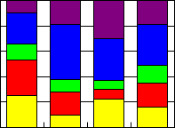
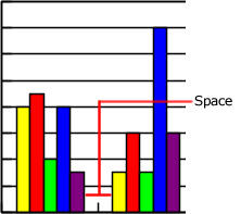
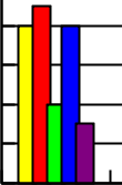
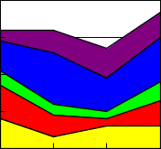
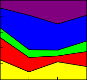
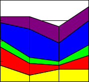
Bar attributes | Set the type of the bar chart, overlapping between data in data series, display interval between item data, and display of section lines. The setting values are enabled only for bar charts.
|
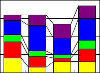
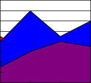
Area attributes | Sets the type of the area chart and the display of drop lines. The setting values are enabled only for area charts.
|
Line attributes | Set the type of the line chart and the display of auxiliary lines. The setting values are enabled only for line charts.
|


Select the multi-page to display the chart ("Multi" tab)
The settings are the same as the Multi-page tab of the property editor. For details, see "Chart item properties ("Multi-page" tab)".